Posts

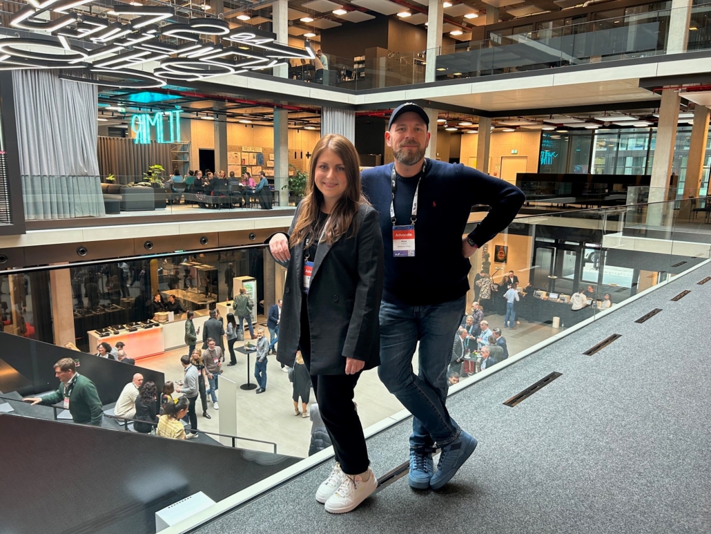
DLD 2023 – Looking ‘Beyond Now’: Implications for the advertising industry

DLD can certainly make your head spin. There are only few conferences out there that manage to pack as many high-class speakers and experts from very diverse fields into a tight schedule of 20 to 30 minute sessions and make it work. Somehow. Covering topics from robotics and the industrial metaverse to the latest developments in neuroscience to the opportunities of generative AI for businesses in an hour is a bold move.

Recalling DLD organizer Steffi Czerny’s opening remarks, it all made sense in the end: We live in a time of global poly-crisis. Old rules often don’t apply anymore, but pessimism is not an option. We must look ‘beyond now’, the conference’s motto, to develop a narrative of progress to discover new opportunities for the future. Innovation in the fields of technology, science, communication, art and design, business and industry can provide us with the tools to take back control and tackle the most pressing issues of our time.

AI as the technology of the year, if not the decade

Generative AI has been one of the major topics in the tech world for quite a while. With the recent release of OpenAI’s ChatGPT in November 2022, the excitement in almost every industry has reached new peaks.

In his tech industry predictions for 2023, Scott Galloway pointed out that unlike other recent technology hypes (namely Metaverse and Crypto), Artificial Intelligence was backed by years of academic research like other key technologies like mobile communication. According to Galloway, AI will do for information workers what robotics did for manufacturing: It will fundamentally reshape entire industries.

New challengers for Google Search

The opportunities of challenging Google’s quasi-monopoly by utilizing AI for search was one major talking point at DLD 2023. Startups such as You.com and Neeva have already integrated AI technology into their search engines. Also, Microsoft’s recent announcement of investing an additional $10bn into OpenAI and their plans to integrate AI into all their products (most importantly into the Bing search engine), could lead to new competitive innovation in the market. However, several speakers, such as Neeva’s CEO Sridhar Ramaswamy and Scott Galloway, pointed out that building an AI powered search competitor is not an easy task due to the increased operational costs and computing power needed. Furthermore, Google employs some of the world’s leading AI engineers and the company has years of experience in the field. So, it is by no means certain that Google will not be able to maintain its dominance.

Alex Turtschan and Simone Jocham, Mediaplus International, at DLD 2023 in our Munich House of Communication

AI as a fluid computer interface

AI might not only change the way we search, but it might also change the way we interact with computers. Today’s interfaces are mostly based around the concepts of apps, often with highly specific use cases, yet lacking a universal, user-centric approach and context sensitivity – as often demonstrated by the lackluster usefulness of many “smart” assistants like Siri, Alexa, and Hey Google. But what if the user could just tell the AI what they wanted to do instead of opening a specific app to solve a problem or complete a task? What if the AI was the smartphone operating system, evoking apps on the go and being highly aware of the context of the problem to be solved?

AI for more fluid and relevant advertising and commerce

As Serviceplan Group CEO Florian Haller pointed out in his session “Beyond Advertising”, many people are annoyed by advertising. Ads often lack relevance and are not relatable. Marketing must become much more immersive to stay relevant. AI can be a part of this by generating relevant product shots and visuals on the go that are tailored exactly to the users’ current expectations and desires – and which might be unique in this form. The same rings true for e-commerce: imagine an online store that doesn’t just show clothes or shoes worn by the brand’s models one doesn’t necessarily relate to, but also provides AI generated shots that match one’s own body type, size, and age?

The future of media and publishing

An inspiring session by Brian Morrissey dealt with the future of publishing. The current media and publishing landscape is quite volatile, and we are facing several bubbles. The streaming market as a direct-to-consumer business is overcrowded with too many players competing for the consumers’ time, attention and share of wallet. We might experience a backswing towards more bundling of content into packages – a landscape, streaming providers initially challenged with their then new business models. Subscriptions have become ubiquitous and have at least partially replaced advertising-based business models in several sectors. With big players like Netflix and Amazon now exploring ad-based tiers for their streaming offerings, we might see a growth of the overall advertising spaces in the video streaming industry.

The big shifts ahead in media and publishing are quite versatile, but come down to human connection, individual relatability, and emotion, not unlike the outlook on the future of advertising drafted by Florian Haller. Individual creators can turn into established brands, a development we have already been seeing in the gaming industry, in live-streaming, and podcasting in recent years. Reaching the biggest audiences no longer is a sustainable future business model, as demonstrated by the disappointing IPO of Buzzfeed and the decline of similar mass-market-mass-appeal-low-effort publications. But most importantly, for Morrissey the future of publishing is about the human connection and emotional bond to the audience, especially in an age of AI-generated, synthetic content.

DLD ventured a wide view into the digital future and the industries affected by it – let’s see where all of this takes us.


How email campaigns can be made more efficient, even as personalisation levels continue to rise.

Addressing customers directly via newsletters is a more attractive option for advertisers than even before, as this makes it possible to send loyal fans precisely the information that interests them. The art of the right message at the right moment – it’s what the future of email marketing is all about.

Long gone are the days of the scattergun approach based on sending everybody the same generic email. Also gone is the time when inserting “Hello firstname lastname!” into the greeting was enough. From now on, Mr Jones needs to receive his post right on time for his morning coffee at 7. Mrs Jones, on the other hand, needs to receive hers at teatime – in polished English, of course – and including a weather forecast. It also needs to include an offer for a jacket that goes perfectly with the blouse that she bought yesterday – not to mention with the low pressure front in the forecast. Long live personalisation!

And automation longer still, because without it, these ever more complex levels of personalisation would no longer be possible. But how can email campaigns as diverse as these be developed so quickly and kept so up to date?

Bundling all of the processes involved together makes for faster newsletter generation

CRM and dialogue agencies have already developed future-oriented newsletter toolboxes that reproduce each working step in a single system: from briefing, to creation, to sending. This enables rapid newsletter production, content adjustment, population with variable data, and distribution on a more individualised basis than ever before – to a million recipients in a million versions, with a single click.  What follows is a short summary of what makes these toolboxes so efficient.

Usability In order for everybody involved to be able to work in the same system, the toolboxes are intuitive and extremely easy to use. Theoretically, no training is required. Much like in Tetris, content modules of different sizes can be placed together one after the other. LIVE! MOBILE OPTIMISED! What you see is what you get. This enables the briefer to define the composition of the newsletter themselves without having to expend large amounts of imaginative effort.  The results can be seen immediately.

Filling the modules is ingeniously simple as well: just upload pictures and enter the texts and links, and you’re all finished. Any changes needed? You can make them at any time.

State-of-the-art design In newsletter template design, “form follows function” is very much the guiding principle. And this is for a good reason: the ultimate objective of a newsletter is to elicit clicks from its subscribers, in order to achieve the highest conversion rates possible. That’s why text and images are perfectly combined in a way that takes into account reading flow, the findings of eye tracking studies, and other relevant factors.

Automation The modules can be linked with corresponding, intelligent databases that permit dynamic content (such as prices, weather forecasts, and times) to be brought into play on a flexible basis

Personalisation Based on a master layout, any number of versions can be easily copied and subsequently personalised, for example by transfer into other languages. Deluxe options among the toolboxes on offer even support languages with different writing directions, such as Hebrew, Farsi, and Arabic.

A/B testing scenarios can be produced easily and within a matter of seconds using the copy function.
By subsequently enriching the versions with individual content – for example, based on user behaviour data from re- or geotargeting – highly relevant content can be created and the full attention of the newsletter readers secured.

Distribution Test emails are a thing of the past – specially developed high-end technologies and regulations ensure no more surprises. Following a quality check, the newsletter is ready to be sent directly, using a delivery system of your choice: Oracle Responsys, Cheetah, Epi, Marketo, or one of many others.

In daily use by Deutsche Lufthansa AG…

…is the so-called Newsletter Cockpit, a multifunctional tool of the type described above created in Munich at the request of Serviceplan Group subsidiary Plan.Net Connect.   The tool sends highly personalised communications winging their way to over 4,100,000 receivers in 104 countries and 16 languages – and is set to send them to many more in the near future.

As designers we are always on the lookout for something new and unique: something that stands out from the crowd and grabs our attention. Constantly on the hunt for the “face” or the look with the potential to take brands into new territory. Fairly often, even if subconsciously, we return to what we already know. The following three blasts from the past will see a renaissance in 2019:

1. Uromis cake stand at the international design festivals

Posters for the tenth Adobe 99U conference in New York did not stand out at first glance, but caught the attention nonetheless thanks to an interesting hint of retro: two-tone, two-dimensional colour gradients transposed onto the simplest geometric shapes and a note of broken white as the background.

THE YOUNG ONES festival, taking place this spring, uses a similar low-key aesthetic. Even though the overall impression is more figurative, the look is still dominated by merging graphic colour gradients. In this case too, the viewer is left with a sense of intimacy.

If you start delving into design history, the origins of this “new visual idea” can be found somewhere between Art Deco and Functionalism – so around one hundred years ago. At the time, crockery with astonishingly forward-looking designs could be seen on many middle-class tables. Abstract and geometric spray patterns created using stencils adorned many manufacturers’ ceramics. Bright primary colours and incremental colour gradients characterised the appearance of emerging mass production. What once acted as a reflection of the leap into uncompromising modernity now, once again, appears very visually attractive because it comes across as slightly unfinished, rough and therefore artisanal and authentic.

2. Coincidental Dadaism through responsive web design

It is no secret that, from an aesthetic perspective, responsive web design (RWD) comes across as a cost-effective, slightly lazy compromise between desktop and mobile variants. Nonetheless, technical use of this “forced marriage” can also create some attractive visual outcomes as for example on the website of fannymyard design. This new style, which some designers are now producing artificially, tends to originate from sources of error and the straitjacket of the limited technical options when using RWD. The forced wrapping of text and image elements in set stages during programming creates accidental collage-like mixes in which headlines may stick right to the edge of the image as on Julie Cristobals website or, as in a recent illustration by W. Stempler,  overlap with an image, but only halfway.

What was until recently an absolute no-no in design terms is now the new design paradigm for various campaigns and corporate designs. Here too, there are parallels with a wild period of the last century: Dadaism. The two most important characteristics of the revolutionary artistic movement consisted of nonsense and coincidence. Examples for their implementation are pictures influenced by Dadaism (to be seen here, here and here).

3. Brutal Design – the power of the ugly

While web design is still getting used to this new self-determination, poster design has revelled in “bad taste” since the 1950s.

However, the message remains unchanged: fighting convention to take a stand against the arbitrary, the pleasant and the interchangable. In the digital age, brutalism is very different from what we are used to seeing. Design’s new extremism is rewarded with the most important currency in our age of short attention spans: the viewer’s undivided attention. Stylistically, the look is characterised by complete minimalism, plainness, classic Hex colour codes in flashy colours, non-contemporary use of fonts and closeness to the traditional code optics as seen at modeselektor, Vicky Boyd, rutgerklamer and Officeus.

Typographical harmony, large-scale images, micro-interactions, carefully crafted navigational approaches or clear hierarchies: all the rules that we were taught to promote good usability fly out the window. You can think what you like about brutalism, but even its critics agree on one thing: compared to the website designs that we are used to, this design trend offers exceptionally short loading times. And that means conversion!

We take a look back at over 20 years in the digital world and the players involved. Then most importantly, it’s time to focus our eyes on the road ahead, as digital agencies, and the challenges we will have to face. Action!

The new Western

It’s a tired metaphor. Way back in 1990, when American activists were worrying that the government was going to take over the Internet, they named their cause the Electronic Frontier Foundation [1]. And the word “Frontier” wasn’t chosen at random. In the American West, the frontier was the artificial boundary between a civilised world governed by laws and a wild and untamed territory [2].

The EFF saw the burgeoning web as the new Wild West, a country beyond the American frontier, where people could say whatever they liked, and were free to create, undertake and experiment.

The metaphor still holds some truth, but history has now caught up with digital. For those who have been living in the digital world for the last twenty years, life is now strangely reminiscent of Once Upon a Time in the West [3].

Twenty years ago, pioneers created the first websites, the first businesses, taking advantage of the opportunities offered by a free and boundless world. Ten years ago, the first infrastructures – search engines, social networks, eCommerce platforms – began to consolidate, and become successful companies. The internet is now comparable to big cities that sprouted from the desert: some companies are still flourishing, but only under the cover of GAFA, and the infrastructure they provide at varying costs. The pioneers have become the users. From creators who started out with the tools to express themselves in a basic style, pioneers have now become residents in a gigantic network of sites and platforms with which they interact daily.

The Electronic Frontier of the pioneers has all but disappeared, giving way to a digital space that we would like to think of as civilised, or at least created logically and with infrastructure. And their fear of the internet falling under the jurisdiction of the government has now given way to their concerns about the stranglehold of Silicon Valley giants.

Our internet civilisation begs the question: where are humans in all this?

The Civilisation of the internet

While its infrastructure has become more sophisticated, the internet has also become democratised. Such a large number of human beings have never been connected to the same tool at the same time. All you need to do is take a look at the attendance figures of some social networks to realise how much digital technology has disappeared from our screens… and given way to interactions: Facebook reports 2.2 billion users, Instagram 1 billion amateur photographers and WeChat has exceeded 1 billion members.

But what do these figures really mean? Do digital users have a real understanding of the ecosystems to which they are contributing? Far removed from the approach taken by the pioneers and creators of the digital world, today’s users consume digital interfaces superficially, without knowing how they work, nor even being aware of the consequences of how they generate and share their content.

In a digital and increasingly automated world that relies more and more on algorithms – and soon Artificial Intelligence – digital illiteracy is becoming more serious, and more widespread.

The myth of the Digital Native – a child who grew up with a computer being naturally gifted for technology – has long since been disproven…

Honesty and transparency

So without full knowledge of how it all works, users not only need simple interactions, but also clear and straightforward interfaces that are honest about the impact of their online behavior, or which digital players are privvy to the content they share. Better still, interfaces are needed that educate and enlighten people about the real issues of our digital society. Between Cambridge Analytica and GDPR, 2018 has been a year of raising awareness.

Digital interactions must be created transparently and honestly, but must also be simple and beautiful to look at. In a nutshell, they need a great design.

These concerns are at the heart of the design profession. Designers should be coming up with systems that interact with humans while being practical, aesthetic, real and economically viable.

Theory of evolution

Between giant and industrial infrastructures and users who aren’t fully aware of what they are doing or what they could be doing, intermediaries need to start redefining their roles.

More specifically, digital agencies that support companies in their daily digital experiences, those that provide users with the tools, content and interfaces that are the gateway to the digital world need to take a good hard look at what they are developing.

Web agencies used to create ecosystems (websites, platforms, intra- and extranets), but are now seeing their role slowly mature.

First because the systems used to create digital platforms are being industrialised. CMS, Workframe and other SAAS platforms sometimes render custom development completely unnecessary. Brands are now online, and services often involve adjusting an existing solution rather than developing an idea from scratch.

Audiences are also now gathering on a handful of very large platforms. Facebook, Instagram, YouTube, as well as other content platforms attract billions of users every day, and have become cornerstones to the online experience. And it’s often easier and more useful to approach people on these networks rather than trying to create a new online contact point. Digital consumers are now being targeted on the spaces and systems they already use.

Digital agencies are having to answer a new question: they are no longer asked to create new ways to use a system, but how to make the most of the existing digital space. They are asked to optimise digital interactions between brands and users. Morphing from their role as creators and builders, agencies have now become developers, interior designers, promoters…

In a word, they are now being asked to design.

Digital agency, Design agency

What is Design? According to some definitions, including Wikipedia’s suggestion, design is the intentional creation of a plan or specification for the construction of an object or system or for the implementation of an activity of process. Design is where art, technology and society converge. And that’s what digital agencies are doing right now.

Agencies aren’t just creating websites, campaigns or content, they are also coming up with the tools and methods that allow these elements to exist and be maintained in the long term. What about the aesthetic and technical aspects of the internet? They’ve been an integral part of agency work for years. Any online content needs to be effective and beautiful, useful and enjoyable. That’s what the internet is all about.

Perhaps the new element in all this is societal responsibility. Digital agencies are now creating, designing, and recommending digital tools to a vast audience whose daily life can be influenced and transformed at the tap of a finger. And that responsibility – if not societal, then at least human – must now be shouldered by all online companies.

Creating daily digital interactions is what makes digital agencies genuine designers in their own right.

Translated from French by Ruth Simpson

Lufthansa’s new look is a model example of thoughtful and intelligent modernisation of a long-established brand. The new look exudes the feeling and respect for the brand and its history, and you get a sense that design methods have been correctly used.

Everything seems familiar, but the new look seems to be simultaneously much clearer, fresher, more elegant and more dynamic. Especially in the case of a successful, evolutionary step, it is worth taking a close look to understand which changes have had which effects. First off is Lufthansa’s most striking symbol – the crane. The brand icon also still seems the same at first glance. However, on taking a closer look, you can see that it is leaner and thereby more dynamic. The character and style have however remained unchanged.

The biggest change that customers will see is perhaps the change in the use of Lufthansa’s corporate colours. The most striking feature is on the aircraft itself: the yellow circle on the blue tail fin is missing.

Colour creates semantic references. Yellow stands for warmth and emotion; blue stands for trust and quality. It is therefore not surprising if people will miss the yellow, i.e. the symbol for emotion, on the aircraft and that a highly controversial discussion of the new corporate design, and in particular the paintwork on the aircraft, is likely to ensue. Looking at the image as a whole, it is obvious that the colour palette has in essence remained the same, but that blue is now clearly the main colour. Yellow is used in places on the signage where trust and closeness should be created.
For digital use, simplifying the colours within the corporate system is certainly the right step.

The new typography is more modern and has gained in character without losing the required objectivity, clarity and seriousness. It is an alignment with the spirit of the times without following it opportunistically.

On the whole, Lufthansa’s new look as a brand provides new impetus and brings a new self-confidence to the fore. It is perhaps a little more distant than before, but this may also be a new facet of the new identity of a German brand on the road to globalisation.

“Iconic brands” are always regarded as the original. They are in the position to claim something for themselves, be it a colour, shape, or logo. The stronger and more unique the brand characteristic codes are, the better the chances are to assert oneself in strong global competition. Coke has at its disposal a unique bottle shape, distinctive lettering and a colour – therefore, everyone who chooses Coke should enjoy this brand experience.

The Coke-colour-sense is not silver, not green, not black. It is simply red. To fail to unequivocally reserve the colour now would be foolish and risky. Competition in the beverage area has significantly increased in recent years.

There is a large risk of losing ground in brand communication by means of sub-brands and thus completely different colour codes. Therefore, it is fitting to place everything on a clear brand image and to promote one brand and one image.

Marketing funds can be bundled and instead of communication for many individual variants, the brand essence can be centrally supported. Communication is becoming ever greater and, in the case of the so-called Love Brands, is now shifting away from product communication towards image communication. Given this, what colour should the brand have? Red? The discussions in the individual marketing departments can be vividly imagined.

A brand needs a unique colour. Nivea followed the same principle several years ago with its brand management. The brand name was placed in a blue circle: the manifestation of the blue container and thus the visual brand essence. And if this is feasible for a product line of hundreds of individual cosmetic items, then it should be child’s play for a brand with few sub-ranges.

Coke’s move is neither particularly brave nor provocative; it is the logical move of value-oriented brand management. Thus, it lays the right foundation for the future, because the more digital brand communication becomes, a clear and, in this case, single-coloured brand image is required.

First published in German by Werben & Verkaufen