
Fanta has become a brand again. Finally! The new logo is compact, distinct, fresh and confident and quite simply fun. Comparing the new and old logo directly, it’s like the sun has risen – that’s how radiant the colours have become. The complementary contrast of orange and blue is shown to optimum effect.
Typographically, the logo is now also right up with the times. Using a take on capital letters from the dancing alphabet, the logo radiates self-confidence and individuality. Switching to the negative white typography and blue shadows creates spatial depth and positive dynamics.
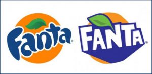
Fanta jumps out of the circle, breaks free, comes alive. The brand wants something from me and draws me in. The balance between the standing a superior brand should have and the vibrant attitude to life conveyed has been achieved with absolute success.
I find the new bottle design really bold. Creating greater autonomy in the shape also is certainly the right move. I just hope that with the material savings in production the bottle is stable enough and will not topple over. The new positioning: The concept of a fun twist bottle has certainly been achieved with the new eye-catching shape. Brands should be representative of the brand values – this is finally the case again with Fanta. Let the fun begin.